Team building drives clarity and confidence:
Steele, a team & resource matchmaker
DESIGN FOR STEELCASE ( 2022.8 - 2022.12 )
USER JTBD · ONBOARDING UX · MULTIPLE USER ROLES
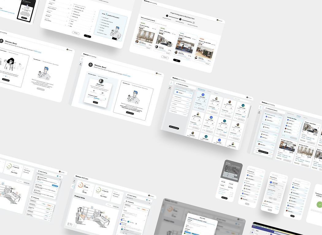
INTRODUCTION
Steele is a match-making platform based on RFP (Request for Proposal) keywords. With it, sales can efficiently and confidently tailor the teams with proper specialists and previous resources for specific projects.
SPONSOR CORPORATION
Steelcase (SCS)
Ryan Schmidt, General manager @SCS studio
DESIGN TEAM
14 weeks - Interaction Design Workshop:
Siyuan Teng, Sunmin Ko, Yiqi Zhong.
PROBLEM
When facing RFPs, sales struggle to find perfectly-fit specialists to team up with due to lack of experience, limited access to resources, and scattered contact points, resulting in unconfidence / project failures.
SOLUTION

-
Matching project resources and specialists, allowing sales to easily reach out to previous teams.
-
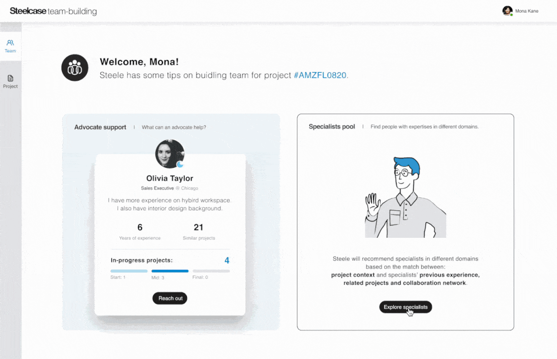
Recommending advocates, as a new role, pass down experiences to nurture the "you're not alone" culture.
IMPACT
-
With 3 times pitches, it drives confidence and clarity with sales when derivative products are needed.
-
Streamlined the team-building task from ~1 hour to less than 10 minutes.
-
User tests show feedback: Viability reached 4.3/5, Usability reached 4.5/5, Learnability reached 4/5.
C U S T O M E R D I S C O V E R Y
PROJECT KICKOFF WITH STEELCASE


Initially, Steelcase shared overwhelming information about its complex business flows, including general personas and all detailed pain points within the journey.
So we need strategies to scope and find the key moments of intervention.
FORMATIVE RESEARCH STRATEGY

Too granular pain points?
Affinity map
We clustered and teased out the main frustration and friction in the end-to-end process.

Insights are too generic?
User interviews (6)
We conducted further research for more in-depth insights to validate user needs.

Scope is too broad?
Email survey (20+)
We prioritized pain points based on the level of pain, impact & ability to impact with SCS's feedback.
GENERAL PERSONA ➡️ IN-DEPTH PERSONA

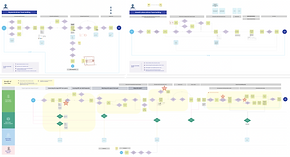
MAPPING KEY MOMENTS INTO FULL USER JOURNEY

View Full Journey Map details.
Compared stress / confidence levels, we identifies 3 opportunity areas.
P R O B L E M R E F R A M I N G
How might we ensure salespeople effectively and efficiently tailor a specialist team and coordinate discussions around RFP?
DESIGN PRINCIPLES
Integrate information seamlessly
Shortcuts for existing app-switch habits.
Contextualize access across devices
Lower effort to actively engage and response.
Consider learning / shifting cost
Provide an intuitive onboarding experience.
Advocate "You're not alone" cultural shift
Responsibility to make decisions collaboratively.

TEAM-BUILDING PLATFORM
H Y P O T H E S E S F O R C O N C E P T S
IDEATION AND EVALUATION

Brainstorm
Sketches: 15+ and 4 main ideas.

Decision Matrix
Prioritized most valuable solutions.

Storyboard for use cases
User stories and JTBDs in 3 cases.
MY MAIN FOCUSED DESIGN OBJECTIVES

User flow
Iterated on flows / IA for key pages.

Wireframes
Iterated on wireflow & layout.
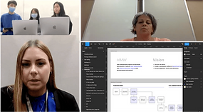
User testing (4)
Validated our concept & prototype.
V A L I D A T I O N - O P T I M I Z A T I O N
Objective 1 - Quickly onboard of "Advocate" concept
[ First-time onboarding ] - Give users a quick overview of what advocates' value and benefits are.
[ Engagement ] - Invite users to try meanwhile allow users to skip.
ITERATIONS
DESIGN CONSIDERATION

Version 1: Popup modal
👎 Low readability for text-based instruction.
👎 Unclear about optimal or required action, users tend to feel annoyed and close all popups.

Version 2: Section on onboarding page
👎 Cannot help users scan instead of reading.
👎 Perceived as required and mundane task.
Final Deliverable 1
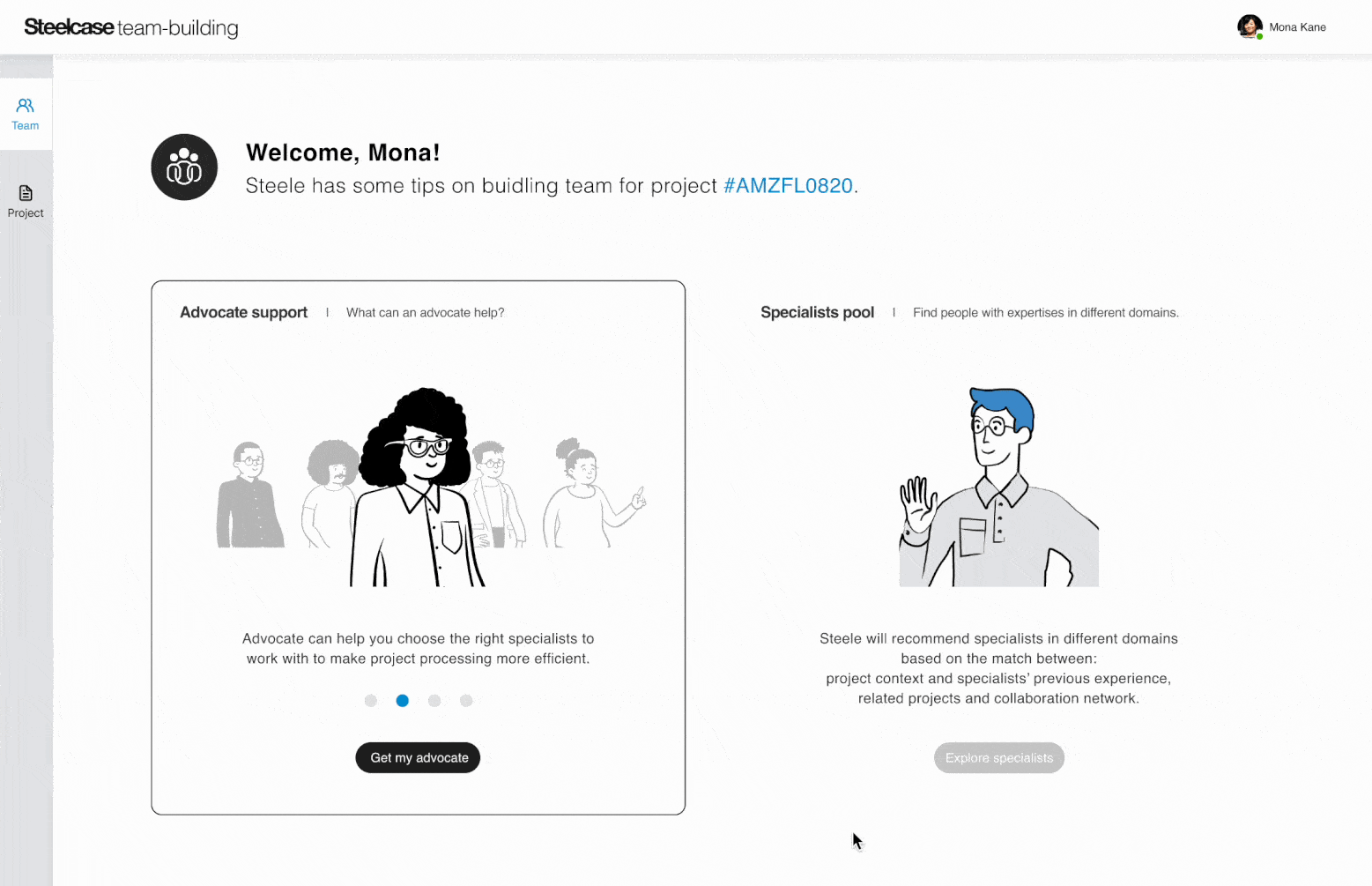
Main improvements:
Break down long text into looping slides with illustrations.
(1) progressive disclosure of advocates' values. (2) more vivid and inviting interaction.
Objective 2 - Efficiently select specialists
[ Viability ] - Present specialist's key qualities and info as selecting criteria.
[ Match real world ] - Integrate point-to-point communications based on current workarounds.
ITERATIONS
DESIGN CONSIDERSATION

Version 1: Specialist card with tags
👎 Lack of card content, can't evaluate the design.
👎 What makes a good fit? - Key criteria of selecting specialist doesn't disclose.
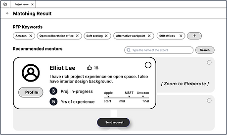
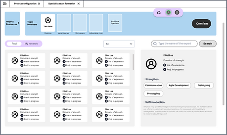
Version 2: New specialist card
👎 Unituitive selecting interaction.
✅ Information architecture of the profile card:

Final Deliverable 2

Main improvements:
(1) Multi-ways to select: by individuals, by previous teams, by networks.
(2) Due to Goal-Gradient Effect, progress bar about estimated team size encourages users to make choices first.
(3) Portrait cards are easier to implement responsive layout than landscape, allowing users to cross-devices.
Objective 3 - Convenience for advocates to help
[ Accessibility ] - Advocates can join quickly, with no additional preparation or special device.
[ Error prevention ] - Warm users before they may make an error, such as specialists' availability status.
ITERATIONS
DESIGN CONSIDERATION
Version 1: Sync by audio
👎 Response effort is too high to select together.
👎 Lack of clear visual focus.

Version 2: Async through mobile
👎 Lack of project brief slows advocates' understanding due to limited time.
👎 Card list should be visually consistent with the laptop interface.
Final Deliverable 3

Main improvements:
(1) Multimodal access: Provide an easier touchpoint on mobile phones.
(2) The card list layout is visually consistent with the computer.
(3) Risk: The use of color has low accessibility, not friendly to distinguish and understand.
P R O T O T Y P E W A L K T H R O U G H
I M P A C T
Pitched to Steelcase 3 times, providing an experience that drives confidence and clarity with sales when special derivative Steelcase products are needed for a client RFP.
-
Streamlined the task of "customizing a specialists team" from ~1 hour to less than 10 minutes.
-
User tests show feedback including Viability reached 4.3/5, Usability reached 4.5/5, and Learnability reached 4/5.
T A K E A W A Y
What to do when feedback from clients and stakeholders conflicts?
-
Use the 5-Whys framework to focus on the essential needs that are hidden under their feedback.
-
Reflect on the way I deliver the concepts, ex. present in functional level to end users, pitch product value level to stakeholders, and elaborate design details to mentors/professors.
-
If the fundamental needs are completely different, we need to pivot our product value proposition and user segmentation to hit a balance/trade-off between business goals and experience goals.
How to convey information hierarchically and vividly to end users?
-
Provide users with structured, visualized, and interactive information while ensuring accessibility.
-
Present the most important information at the right time, avoiding info overload caused by presenting those that the user does not need to know in the current context.
-
Provide different ways of organizing information based on users' diverse behavioral patterns, allowing users to switch flexibly and choose a structure that is more digestible for themselves.
How to effectively lead a team, especially facilitate meetings & workshops?
-
A meeting can have different roles, such as facilitator, note-taker, time-keeper, etc. Clarify these roles to avoid one person talking too much and others being overwhelmed by how to participate.
-
Knowledge can be learned but trust needs to be earned. As a leader, when the team members are silent and not constructive at that time, I need to be brave enough to speak up.
-
Breaks in the meeting, especially when members are stuck in their thoughts and depressed.